這裡介紹如何使用 R 的 ggmap 套件來繪製地圖,並且把自己的資料依照經緯度畫在地圖上。
ggmap 套件是一個專門用來繪製地圖的 R 套件,它可以自動從 Google 地圖、OpenStreetMap、Stamen Maps 或 CloudMade Maps 網站上下載指定位置的地圖,讓使用者使用 ggplot 的語法來結合地圖與資料並進行繪製。
除了基本的資料點標示之外,使用者還可以透過 ggmap 的所提供的函數來使用 Google 地圖 API 的各種功能,非常方便。
繪製基本地圖
ggmap 套件中的 get_map 函數可以讓我們在 R 的環境中直接下載地圖,接著再呼叫 ggmap 函數就可以畫出來。若要繪製台灣的地圖,可以執行:
library(ggmap)
library(mapproj)
map <- get_map(location = 'Taiwan', zoom = 7)
ggmap(map)
地圖的位置是透過 location 參數來指定,直接輸入地名即可,而 zoom 則是控制地圖的大小。這是畫出來的圖:
get_map 有相當多的參數可以使用,language 可以設定地圖上文字標示的語言:
map <- get_map(location = 'Taiwan', zoom = 7,
  language = "zh-TW")
ggmap(map)
這是畫出來的圖:
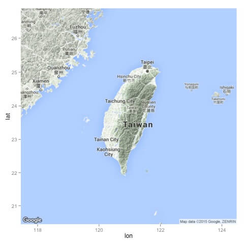
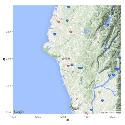
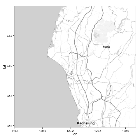
location 參數也可以接受經緯度,需要畫出比較精確的位置時,可以這樣使用:
map <- get_map(location = c(lon = 120.233937, lat = 22.993013),
  zoom = 10, language = "zh-TW")
ggmap(map)
這是畫出來的圖:
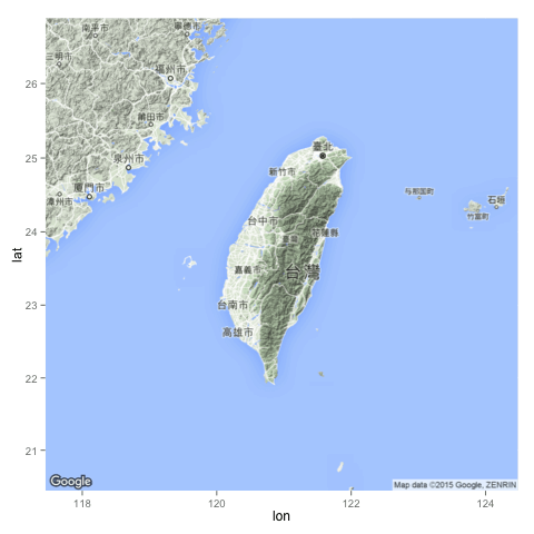
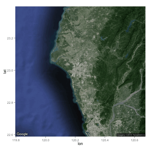
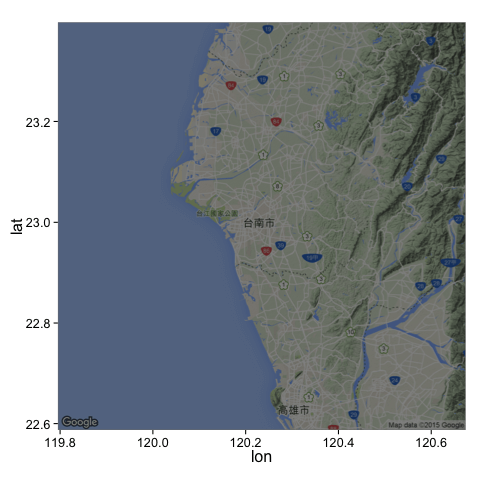
maptype 參數可以指定地圖的類型(預設是 terrain):
map <- get_map(location = c(lon = 120.233937, lat = 22.993013),
  zoom = 10, language = "zh-TW", maptype = "roadmap")
ggmap(map)
以下是幾種常見的地圖類型:
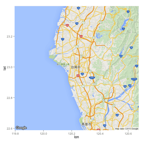
這種黑白的地圖在顯示資料時很好用。
ggmap 的 darken 這個參數可以讓地圖變暗(或是變亮):
map <- get_map(location = c(lon = 120.233937, lat = 22.993013),
  zoom = 10, language = "zh-TW")
ggmap(map, darken = 0.5)
這是畫出來的圖:
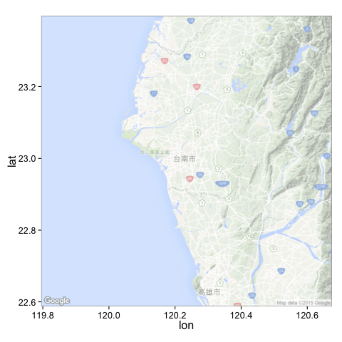
若要讓地圖變亮,可以執行:
map <- get_map(location = c(lon = 120.233937, lat = 22.993013),
  zoom = 10, language = "zh-TW")
ggmap(map, darken = c(0.5, "white"))
這是畫出來的圖:
darken 基本上就是在地圖上多加一層圖層,透過指定透明度與顏色,就可以做出很多變化。
將資料畫在地圖上
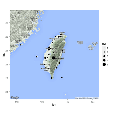
有了地圖之後,接著就是要將自己的資料畫在地圖上,我們以台灣的紫外線監測資料為例,示範如何將具有經緯度的資料畫在地圖上。
首先從政府資料開放平臺上下載紫外線即時監測資料的 csv 檔,接著將資料讀進 R 中。(這裡我用的資料是 2015/11/16 15:22:15 的資料)
uv <- read.csv("UV_20151116152215.csv")
這裡原始的經緯度資料是以度分秒表示,在使用前要轉換為度數表示。
lon.deg <- sapply((strsplit(as.character(uv$WGS84Lon), ",")), as.numeric)
uv$lon <- lon.deg[1, ] + lon.deg[2, ]/60 + lon.deg[3, ]/3600
lat.deg <- sapply((strsplit(as.character(uv$WGS84Lat), ",")), as.numeric)
uv$lat <- lat.deg[1, ] + lat.deg[2, ]/60 + lat.deg[3, ]/3600
接著使用 ggplot 的語法,把資料加入地圖中:
library(ggmap)
map <- get_map(location = 'Taiwan', zoom = 7)
ggmap(map) + geom_point(aes(x = lon, y = lat, size = UVI), data = uv)
ggmap 負責畫出基本的地圖,然後再使用 geom_point 加上資料點,除了指定經緯度之外,我們還使用紫外線的強度(UVI)來指定圓圈的大小。這是畫出來的圖:
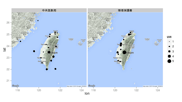
依照資料發佈單位(PublishAgency)分開畫圖:
ggmap(map) +
  geom_point(aes(x = lon, y = lat, size = UVI), data = uv) +
  facet_grid( ~ PublishAgency)
這是畫出來的圖:
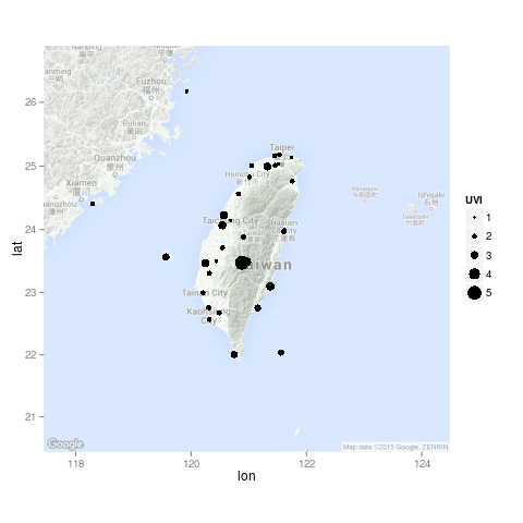
把地圖的顏色調淡一點,讓資料點更清楚:
ggmap(map, darken = c(0.5, "white")) +
  geom_point(aes(x = lon, y = lat, size = UVI), data = uv)
這是畫出來的圖:
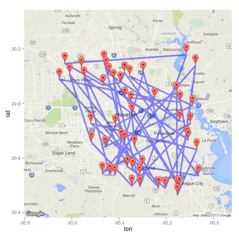
使用 Google 地圖的標記(marker)與路徑(path):
d <- function(x=-95.36, y=29.76, n,r,a){
  round(data.frame(
    lon = jitter(rep(x,n), amount = a),
    lat = jitter(rep(y,n), amount = a)
  ), digits = r)
}
df <- d(n = 50,r = 3,a = .3)
map <- get_googlemap(markers = df, path = df,, scale = 2)
ggmap(map)
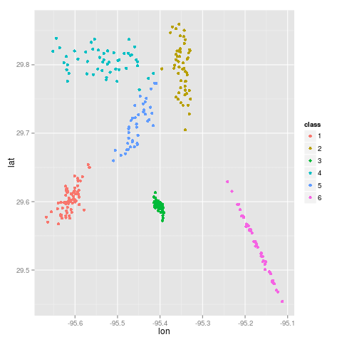
以下我們介紹一些進階的用法,首先產生一些測試用的資料:
mu <- c(-95.3632715, 29.7632836)
nDataSets <- sample(4:10,1)
chkpts <- NULL
for(k in 1:nDataSets){
  a <- rnorm(2); b <- rnorm(2);
  si <- 1/3000 * (outer(a,a) + outer(b,b))
  chkpts <- rbind(chkpts,
    cbind(MASS::mvrnorm(rpois(1,50), jitter(mu, .01), si), k))
}
chkpts <- data.frame(chkpts)
names(chkpts) <- c("lon", "lat","class")
chkpts$class <- factor(chkpts$class)
qplot(lon, lat, data = chkpts, colour = class)
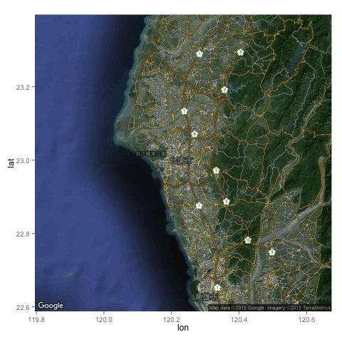
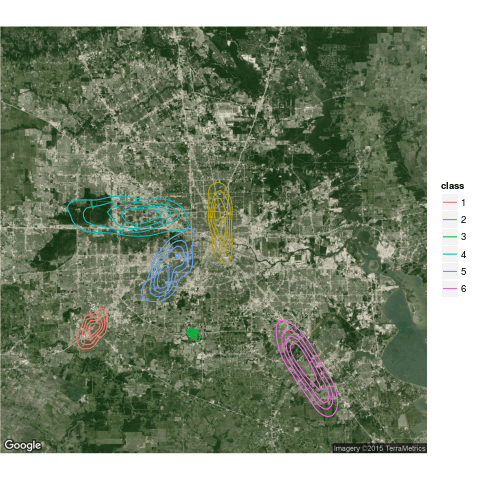
用等高線圖畫在地圖上:
ggmap(get_map(maptype = "satellite"), extent = "device") +
stat_density2d(aes(x = lon, y = lat, colour = class), data = chkpts, bins = 5)
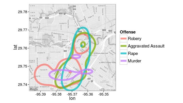
將 crime 資料整理一下:
# only violent crimes
violent_crimes <- subset(crime,
    offense != "auto theft" &
    offense != "theft" &
    offense != "burglary"
    )

# rank violent crimes
violent_crimes$offense <-
factor(violent_crimes$offense,
    levels = c("robbery", "aggravated assault",
      "rape", "murder")
    )

# restrict to downtown
violent_crimes <- subset(violent_crimes,
    -95.39681 <= lon & lon <= -95.34188 &
    29.73631 <= lat & lat <=  29.78400
    )
畫等高線圖:
library(grid)
theme_set(theme_bw(16))
HoustonMap <- qmap("houston", zoom = 14, color = "bw")

# a contour plot
HoustonMap +
stat_density2d(aes(x = lon, y = lat, colour = offense),
    size = 3, bins = 2, alpha = 3/4, data = violent_crimes) +
scale_colour_discrete("Offense", labels = c("Robery","Aggravated Assault","Rape","Murder")) +
theme(
    legend.text = element_text(size = 15, vjust = .5),
    legend.title = element_text(size = 15,face="bold"),
    legend.key.size = unit(1.8,"lines")
    )
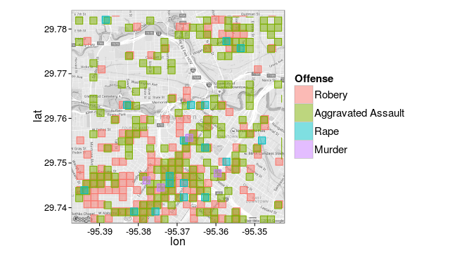
二維的 histogram:
# 二維的 histogram
HoustonMap +
stat_bin2d(aes(x = lon, y = lat, colour = offense, fill = offense),
    size = .5, bins = 30, alpha = 2/4, data = violent_crimes) +
scale_colour_discrete("Offense",
    labels = c("Robery","Aggravated Assault","Rape","Murder"),
    guide = FALSE) +
scale_fill_discrete("Offense", labels = c("Robery","Aggravated Assault","Rape","Murder")) +
theme(
    legend.text = element_text(size = 15, vjust = .5),
    legend.title = element_text(size = 15,face="bold"),
    legend.key.size = unit(1.8,"lines")
    )
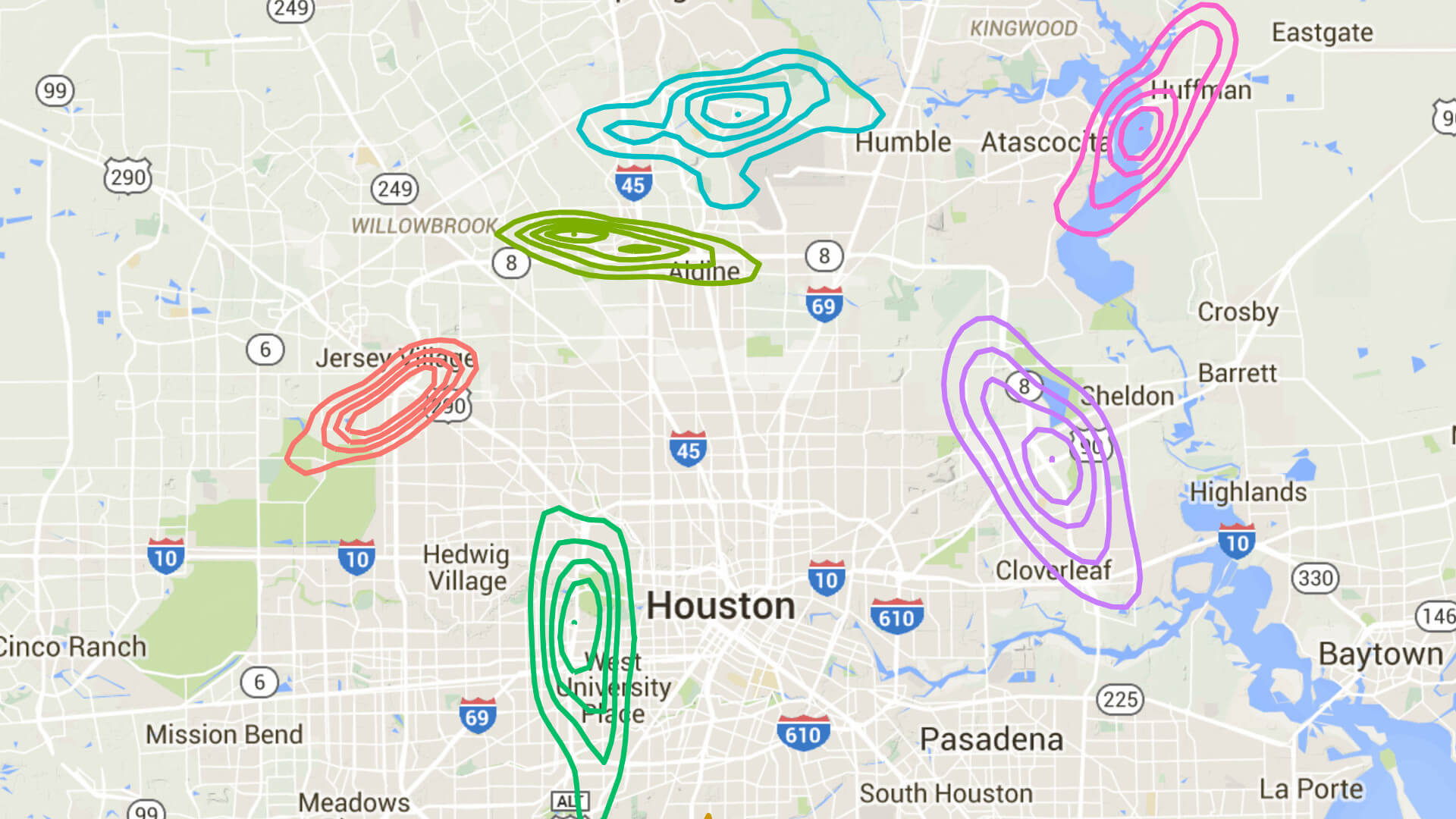
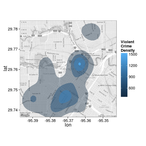
另一種等高線圖:
HoustonMap +
stat_density2d(aes(x = lon, y = lat, fill = ..level.., alpha = ..level..),
    size = 2, bins = 4, data = violent_crimes, geom = "polygon") +
scale_fill_gradient("ViolentnCrimenDensity") +
  scale_alpha(range = c(.4, .75), guide = FALSE) +
guides(fill = guide_colorbar(barwidth = 1.5, barheight = 10))
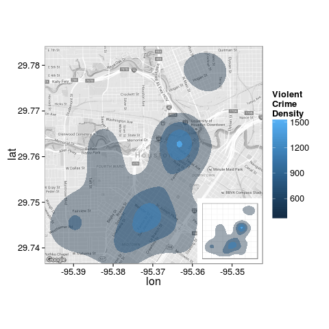
加上另外一個圖層:
houston <- get_map("houston", zoom = 14)
overlay <- stat_density2d(aes(x = lon, y = lat, fill = ..level.., alpha = ..level..), bins = 4, geom = "polygon", data = violent_crimes)

HoustonMap +
stat_density2d(aes(x = lon, y = lat, fill = ..level.., alpha = ..level..),
    bins = 4, geom = "polygon", data = violent_crimes) +
scale_fill_gradient("ViolentnCrimenDensity") +
scale_alpha(range = c(.4, .75), guide = FALSE) +
guides(fill = guide_colorbar(barwidth = 1.5, barheight = 10)) +
inset(
    grob = ggplotGrob(ggplot() + overlay +
      scale_fill_gradient("ViolentnCrimenDensity") +
      scale_alpha(range = c(.4, .75), guide = FALSE) +
      theme_inset()
      ),
    xmin = attr(houston,"bb")$ll.lon +
    (7/10) * (attr(houston,"bb")$ur.lon - attr(houston,"bb")$ll.lon),
    xmax = Inf,
    ymin = -Inf,
    ymax = attr(houston,"bb")$ll.lat +
    (3/10) * (attr(houston,"bb")$ur.lat - attr(houston,"bb")$ll.lat)
    )
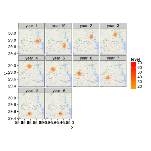
多張等高線圖:
df <- data.frame(
    x = rnorm(10*100, -95.36258, .05),
    y = rnorm(10*100,  29.76196, .05),
    year = rep(paste("year",format(1:10)), each = 100)
    )
for(k in :9){
  df$x[1:100 + 100*k] <- df$x[1:100 + 100*k] + sqrt(.05)*cos(2*pi*k/10)
    df$y[1:100 + 100*k] <- df$y[1:100 + 100*k] + sqrt(.05)*sin(2*pi*k/10)
}

ggmap(get_map(),
    base_layer = ggplot(aes(x = x, y = y), data = df)) +
stat_density2d(aes(fill = ..level.., alpha = ..level..),
    bins = 4, geom = "polygon") +
scale_fill_gradient2(low = "white", mid = "orange", high = "red", midpoint = 10) +
  scale_alpha(range = c(.2, .75), guide = FALSE) +
facet_wrap(~ year)