
細部分析
將資料依據地理位置與時間區分,進行細部的分析。
將最嚴重的五個行政區病例資料篩選出來:
dengue.top.reg <- dengue.tn[
  dengue.tn$區別 == "北區" |
  dengue.tn$區別 == "中西區" |
  dengue.tn$區別 == "南區" |
  dengue.tn$區別 == "東區" |
  dengue.tn$區別 == "永康區", ]
依據時間畫出這 5 個行政區的疫情變化:
ggplot(dengue.top.reg, aes(x=as.Date(確診日))) +
  stat_bin(binwidth=7, position="identity") +
  scale_x_date(breaks=date_breaks(width="1 month")) +
  theme(axis.text.x = element_text(angle=90)) +
  xlab("日期") + ylab("病例數") +
  ggtitle("登革熱每週病例數") + facet_grid(區別 ~ .)

依照月份來畫圖:
ggplot(dengue.top.reg, aes(x=as.Date(確診日))) +
  stat_bin(breaks=as.numeric(seq(as.Date('2015-1-1'),
    as.Date('2015-12-1'), '1 month')), position="identity") +
  scale_x_date(breaks=date_breaks(width="1 month")) +
  theme(axis.text.x = element_text(angle=90)) +
  xlab("日期") + ylab("病例數") +
  ggtitle("登革熱每月病例數") + facet_grid(區別 ~ .)
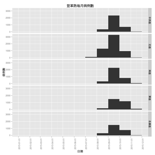
看起來這 5 個區域最嚴重的時間都在 9 月中旬附近。
依據月份區分,畫出每個月的登革熱病例分佈地圖。
map <- get_map(location = c(lon = 120.246100, lat = 23.121198),
  zoom = 10, language = "zh-TW")
ggmap(map, darken = c(0.5, "white")) +
  geom_point(aes(x = 經度座標, y = 緯度座標),
  color = "red", data = dengue.tn) +
  facet_wrap(~ month)

定點分析
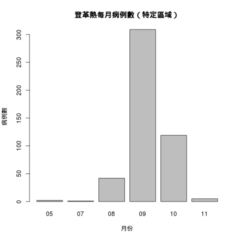
假設某人居住在台南市,其住家的經緯度座標為 (22.997088, 120.201771),而登革熱病媒蚊飛行活動範圍可遠至 400 ~ 800 公尺的地區,將此人住家 400 公尺以內的病例資料篩選出來,觀察每個月的疫情變化。
這是計算地球上兩點之間距離的函數,輸入兩點的經緯度,可以計算出兩點之間的距離,單位為公里。
earthDist <- function (lon1, lat1, lon2, lat2){
  rad <- pi/180
  a1 <- lat1 * rad
  a2 <- lon1 * rad
  b1 <- lat2 * rad
  b2 <- lon2 * rad
  dlon <- b2 - a2
  dlat <- b1 - a1
  a <- (sin(dlat/2))^2 + cos(a1) * cos(b1) * (sin(dlon/2))^2
  c <- 2 * atan2(sqrt(a), sqrt(1 - a))
  R <- 6378.145
  d <- R * c
  return(d)
}
篩選出 400 公尺以內的病例資料:
home.pos <- c(22.997088, 120.201771) # (緯度, 經度)
home.dist <- earthDist(dengue.tn$經度座標, dengue.tn$緯度座標, home.pos[2],  home.pos[1])
home.idx <- home.dist <= 0.4;
dengue.home <- dengue.tn[home.idx, ]
查看每個月的資料狀況:
table(dengue.home$month)
 05  07  08  09  10  11
  2   1  42 309 119   5
畫成圖形:
barplot(table(dengue.home$month), xlab = "月份", ylab = "病例數",
  main = "登革熱每月病例數(特定區域)")
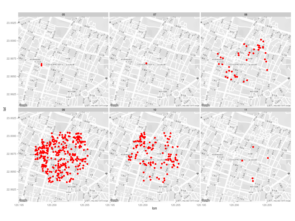
每個月的病例分佈:
map <- get_map(location = c(lon = home.pos[2], lat = home.pos[1]),
  zoom = 16, language = "zh-TW", color = "bw")
ggmap(map) +
  geom_point(aes(x = 經度座標, y = 緯度座標),
  color = "red", data = dengue.home, size = 5) +
  facet_wrap(~ month)

由於經緯度資料的精確度不足,造成大量的資料點重疊,因此改用 jitter 的方式畫圖:
map <- get_map(location = c(lon = home.pos[2], lat = home.pos[1]),
  zoom = 16, language = "zh-TW", color = "bw")
ggmap(map) +
  geom_jitter(aes(x = 經度座標, y = 緯度座標),
  size = 3, position = position_jitter(w = 0.0005, h = 0.0005),
  data = dengue.home, color = "red") +
  facet_wrap(~ month)
這樣可以比較清楚呈現資料的分布狀況:
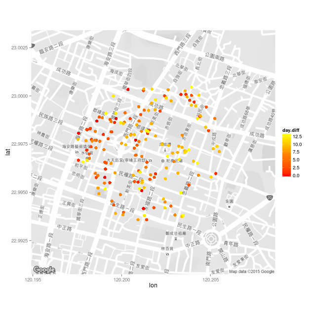
假設今天是 2015 年 9 月 15 日,在地圖上畫出此人住家 400 公尺以內,2 週之內新增的病例分佈地圖。
篩選出此人住家 400 公尺以內,兩週之內新增的病例:
dengue.home$day.diff <- as.numeric(as.Date(dengue.home$確診日) - as.Date("2015/09/15"))
dengue.home.subset <- dengue.home[dengue.home$day.diff >= 0 & dengue.home$day.diff < 14, ]
依照時間決定顏色畫圖:
map <- get_map(location = c(lon = home.pos[2], lat = home.pos[1]),
  zoom = 16, language = "zh-TW", color = "bw")
ggmap(map) +
  geom_jitter(aes(x = 經度座標, y = 緯度座標, color = day.diff),
  size = 3, position = position_jitter(w = 0.0005, h = 0.0005),
  data = dengue.home.subset) +
  scale_colour_gradientn(colours=heat.colors(3))
參考資料:Using R: barplot with ggplot2、
Plot Weekly or Monthly Totals in R、Quick-R、
Rotating x axis labels in R for barplot
繼續閱讀: 12
Tim
謝謝分享
Yen
你好,
我從台南市政府下載的104年登革熱病例數資料,從20463筆開始都是亂碼,用excel讀取csv,更改任何編碼模式都無法正常顯示
程式新手用mac還沒摸熟怎麼使用emacs編輯csv檔案
想向您請教解決方式
Douglas
> dengue <- read.csv("dengue-20151107-big5.csv")
Error in file(file, "rt") : cannot open the connection
In addition: Warning message:
In file(file, "rt") :
cannot open file 'dengue-20151107-big5.csv': No such file or directory
讀不到不知道為什麼