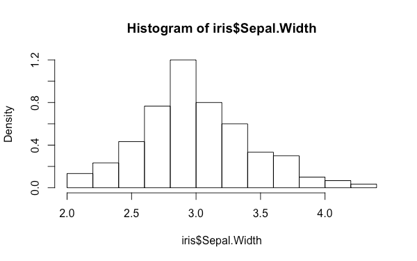
直方圖也是一種很常見的圖形,它可以讓我們看出整個資料大致上的分佈狀況。
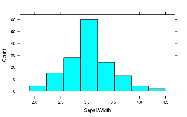
base 系統在 base 系統上的直方圖可以使用 hist 函數來繪製:
hist(iris$Sepal.Width)
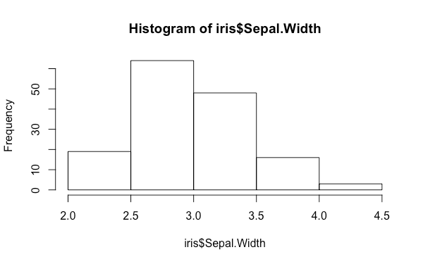
預設的狀況下 hist 繪圖時會以資料的頻率作為 y 軸的單位,若要以機率值為單位(總面積和為 1),可以將 freq 參數指定為 FALSE:
hist(iris$Sepal.Width, freq = FALSE)
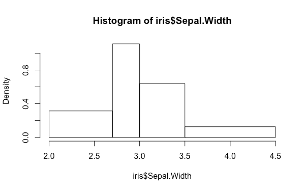
hist 預設會使用 Sturges 的方式自動計算 bin 的數目,我們也可以用 breaks 參數自行指定:
hist(iris$Sepal.Width, breaks = 5)
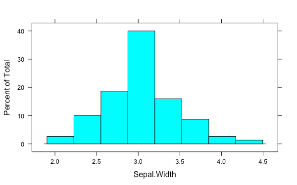
甚至也可以指定不等寬的 bins:
hist(iris$Sepal.Width, breaks = c(2, 2.7, 3, 3.5, 4.5))
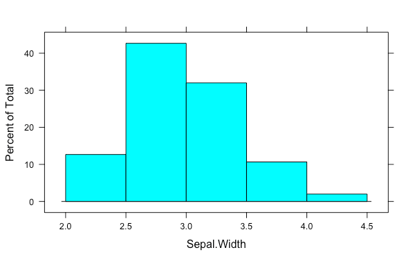
lattice 系統lattice 系統的直方圖可以使用 histogram 繪製,用法與 base 系統類似,只是改以公式的方式指定資料而已:
histogram(~ Sepal.Width, iris)
histogram 的 y 軸單位有三種方式選擇,分別為:percent、count 與 density:
histogram(~ Sepal.Width, iris, type = "count")
breaks 的用法也跟 hist 相同:
histogram(~ Sepal.Width, iris, breaks = 5)
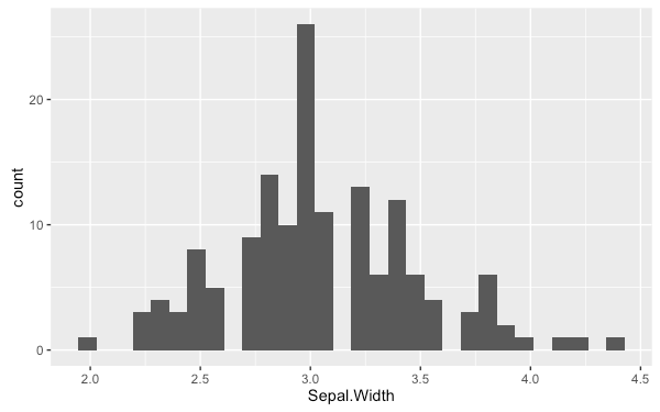
ggplot2 系統在 ggplot2 系統中直方圖可以使用 geom_histogram 繪製:
ggplot(iris, aes(Sepal.Width)) +
  geom_histogram()
bins 可以指定 bin 的數量:
ggplot(iris, aes(Sepal.Width)) +
  geom_histogram(bins = 5)
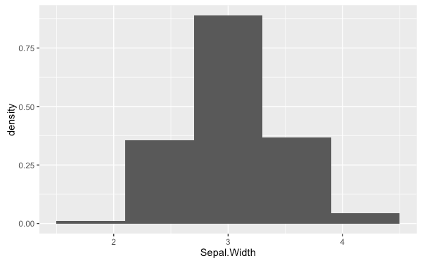
若要改變 y 軸的單位,可以從 aes 的對應關係來指定,可用的參數有 ..count.. 與 ..density..,分別代表次數與密度:
ggplot(iris, aes(x = Sepal.Width, y = ..density..)) +
  geom_histogram(bins = 5)