這裡介紹 R 的一些基本繪圖函數使用方式。
plot 函數
這裡我們繼續採用 vegetation 的資料來做示範,這個資料是黃石國家公園(Yellowstone National Park)與 National Bison Range 所觀測到的草原生態資料,研究的目的在於觀察這裡的生物多樣性是否有隨著時間而改變。首先讀取
Veg <- read.table(file = "Vegetation2.txt", header = TRUE)
如果我們想要畫出物種豐富度(Veg$R)與外露泥土(Veg$BARESOIL)的關係分布圖,可以執行:
plot(Veg$BARESOIL, Veg$R)
畫出來的圖會像這樣
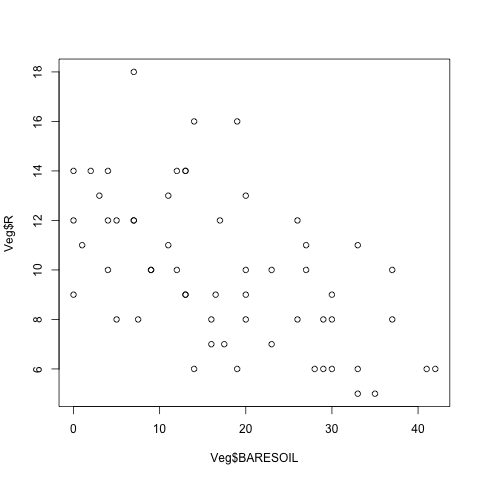
plot 函數的第一個參數是指定橫軸的資料,而第二個參數則是指定縱軸的資料,通常我們會習慣將反應變數(response variable)設定為縱軸,而解釋變數(explanatory variable)設定為橫軸。這裡要注意一點,在 R 中有許多函數在指定模型時,反應變數會寫在前面,接著才是解釋變數,如果怕混淆,可以使用具名參數的寫法:
plot (x = Veg$BARESOIL, y = Veg$R)
plot 也可以使用 data 參數指定資料來源的 data frame,但是他的用法會有些不同:
plot (R ~ BARESOIL, data = Veg)
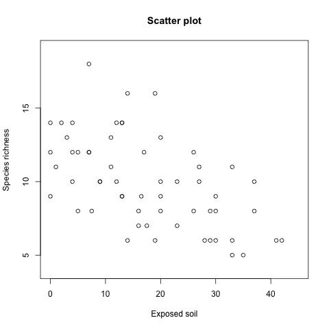
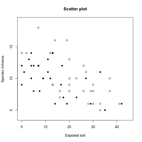
我們可以利用 plot 所提供的各種參數設定座標軸的名稱、繪圖區間等等資訊:
plot (x = Veg$BARESOIL, y = Veg$R,
  xlab = "Exposed soil",
  ylab = "Species richness",
  main = "Scatter plot",
  xlim = c(0, 45), ylim = c(4, 19))
xlab 與 ylab 是指定 x 軸與 y 軸的
畫出的圖形為
我們也可以用這樣的方式自動指定繪圖的區間:
xlim = c(min(Veg$BARESOIL), max(Veg$BARESOIL))
如果資料中存在有缺失值,記得要加上 na.rm = TRUE:
xlim = c(min(Veg$BARESOIL, na.rm = TRUE),
  max(Veg$BARESOIL, na.rm = TRUE))
資料點的符號、顏色與大小
在畫圖時最常見的需求就是依據不同的資料,指定資料點的符號、顏色與大小,以下介紹一些基本的使用方式。
資料點符號
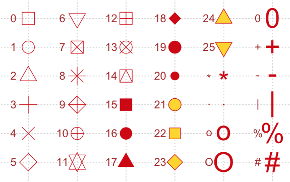
plot 預設會使用圓圈來標示資料點,我們可以透過 pch 參數來使用不同的資料點符號,可用的符號如下:
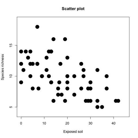
假設要將符號設定為實心的圓點(編號 16),可以執行:
plot(x = Veg$BARESOIL, y = Veg$R,
  xlab = "Exposed soil",
  ylab = "Species richness", main = "Scatter plot",
  xlim = c(0, 45), ylim = c(4, 19), pch = 16)
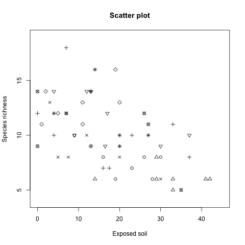
vegetation 的資料是從 8 個斷面(transect)中所蒐集到的,如果我們想在圖形上區分出不同斷面的資料分佈,我們可以將 pch 直接指定為斷面的編號,這樣就可以用不同的符號表示不同的斷面,首先先檢查一下斷面的實際資料:
Veg$Transect
輸出為
[1] 1 1 1 1 1 1 1 2 2 2 2 2 2 2 3 3 3 3 3
[20] 3 3 3 4 4 4 4 4 4 4 4 5 5 5 5 5 5 5 5
[39] 6 6 6 6 6 6 6 6 7 7 7 7 7 7 8 8 8 8 8
[58] 8
由於斷面的資料剛好是從 1 到 8 的數字,而這些數字也都有對應到 pch 的符號,所以可以不需要做額外的轉換,直接就可以指定給 pch:
plot(x = Veg$BARESOIL, y = Veg$R,
  xlab = "Exposed soil", ylab = "Species richness",
  main = "Scatter plot", xlim = c(0, 45),
  ylim = c(4, 19), pch = Veg$Transect)
畫出的圖形為
這種用資料的數值來指定 pch 的方式有一些地方要注意:
- 如果
Veg$Transect的數值是從0開始編號的話(0、1、2、⋯⋯),就不能直接將Veg$Transect指定給pch,否則所有編號為0的資料會畫不出來。 - 如果
Veg$Transect的資料長度跟Veg$BARESOIL與Veg$R不同的話,會造成畫出來的資料點符號錯誤。假設Veg$Transect的資料長度,R 會在資料長度不夠時,自動重複使用Veg$Transect的資料,而在我們這個例子中,所有變數的資料長度都相同,所以沒有這樣的問題。 pch只能接受整數的資料,如果指定為 factor 的話,會出現錯誤。
如果我們需要依照資料的年份來指定資料點符號的話,步驟就會比較複雜,因為一般的年份(例如 1967)沒有剛好對應的 pch 數值,所以還要另外在建立一個數值向量來指定資料點符號。
假設我們要將資料依據年份(Veg$Time)來區分,把 1974 年以前的資料跟 1974 年以後的資料分開,分別用編號 1 與 16 的符號來表示資料點,則操作步驟如下:
Veg$Time2 <- Veg$Time
Veg$Time2 [Veg$Time <= 1974] <- 1
Veg$Time2 [Veg$Time > 1974] <- 16
Veg$Time2
輸出為
[1]  1  1  1  1 16 16 16  1  1  1  1 16 16
[14] 16  1  1  1  1 16 16 16 16  1  1  1  1
[27] 16 16 16 16  1  1  1  1 16 16 16 16  1
[40]  1  1  1 16 16 16 16  1  1  1 16 16 16
[53]  1  1  1 16 16 16
這裡先建立一個 Veg$Time 向量,其內容就是每一筆資料所對應的 pch 值,接著就可以使用這個向量來指定資料點的符號:
plot(x = Veg$BARESOIL, y = Veg$R,
  xlab = "Exposed soil",
  ylab = "Species richness", main = "Scatter plot",
  xlim = c(0, 45), ylim = c(4, 19),
  pch = Veg$Time2)
畫出來的圖形為
關於 pch 的詳細說明,可以參考 points 線上手冊:
?points
資料點顏色
使用不同的顏色來表示不同的資料也是常見的繪圖方式,資料點的顏色是用 col 參數來指定的:
plot(x = Veg$BARESOIL, y = Veg$R,
  xlab = "Exposed soil",
  ylab = "Species richness", main = "Scatter plot",
  xlim = c(0, 45), ylim = c(4, 19),
  col = 2)
畫出來的圖形為
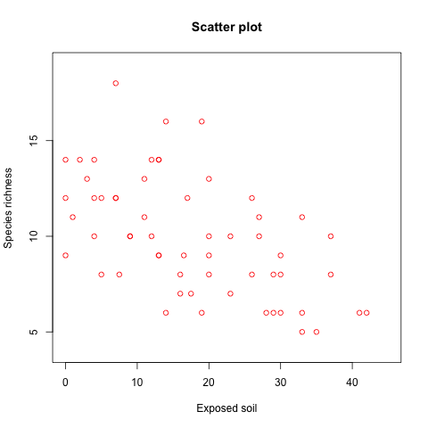
col 指定的整數會透過 palette 對應到實際使用的顏色,我們可以執行 palette 查看目前的顏色對應:
palette()
預設的輸出為
[1] "black"   "red"     "green3"  "blue"
[5] "cyan"    "magenta" "yellow"  "gray"
編號 1 對應到的顏色是黑色,編號 2 則是紅色,以此類推。另外 col 還可以使用很多種方式指定顏色,詳細說明請參考 par 的線上手冊。
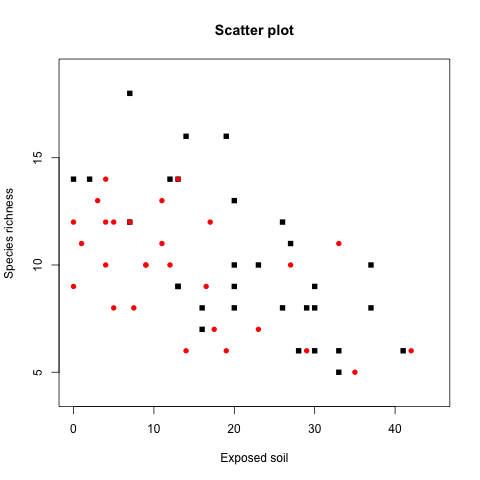
col 跟 pch 的使用方式類似,也都可以靠著向量的方式指定個別資料點的顏色,假設我們要將 1974 年以前的資料用黑色實心的方塊表示,而其餘的資料則用紅色實心的圓圈表示,可以這樣做:
Veg$Time2 <- Veg$Time
Veg$Time2 [Veg$Time <= 1974] <- 15
Veg$Time2 [Veg$Time > 1974] <- 16
Veg$Col2 <- Veg$Time
Veg$Col2 [Veg$Time <= 1974] <- 1
Veg$Col2 [Veg$Time > 1974] <- 2
plot(x = Veg$BARESOIL, y = Veg$R,
  xlab = "Exposed soil",
  ylab = "Species richness", main = "Scatter plot",
  xlim = c(0, 45), ylim = c(4, 19),
  pch = Veg$Time2, col = Veg$Col2)
畫出來的圖形為
資料點大小
圖形中資料點的大小可以使用 cex 參數來指定,其預設值是 1,若指定為 2.5 的話,所有的資料點就會變成原來的 2.5 倍大:
plot(x = Veg$BARESOIL, y = Veg$R,
  xlab = "Exposed soil", ylab = "Species richness",
  main = "Scatter plot",
  xlim = c(0, 45), ylim = c(4, 19),
  pch = 16, cex = 2.5)
畫出來的圖形為
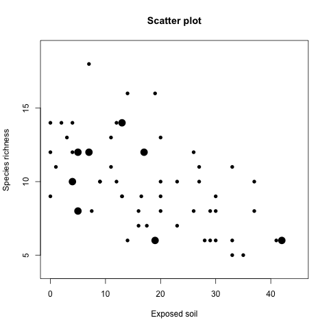
cex 同樣也可以使用向量的方式指定個別的資料點:
Veg$Cex2 <- Veg$Time
Veg$Cex2[Veg$Time == 2002] <- 2
Veg$Cex2[Veg$Time != 2002] <- 1
plot(x = Veg$BARESOIL, y = Veg$R,
  xlab = "Exposed soil", ylab = "Species richness",
  main = "Scatter plot",
  xlim = c(0, 45), ylim = c(4, 19),
  pch = 16, cex = Veg$Cex2)
畫出來的圖形為
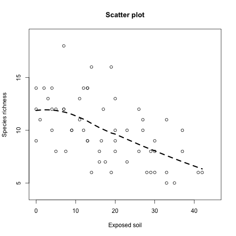
平滑曲線
在上面的圖形中,由於整個資料沒有很明顯的趨勢,這時候可以利用 loess 配適一條平滑曲線,幫助我們更容易抓出整個資料大概的走勢:
plot(x = Veg$BARESOIL, y = Veg$R,
  xlab = "Exposed soil",
  ylab = "Species richness", main = "Scatter plot",
  xlim = c(0, 45), ylim = c(4, 19))
M.Loess <- loess(R ~ BARESOIL, data = Veg)
Fit <- fitted(M.Loess)
Ord1 <- order(Veg$BARESOIL)
lines(Veg$BARESOIL[Ord1], Fit[Ord1],
  lwd = 3, lty = 2)
練習題
Amphibian_road_Kills.xls 是兩棲動物在葡萄牙馬路上的死亡資料,TOT.N 是該觀測點動物的死亡數,而 OLIVE 是橄欖樹的數量,D.PARK 則是觀測點到最近的自然公園之間的距離。
請將 Amphibian_road_Kills.xls 的資料讀入 R,並且依序進行下列動作:
- 畫出
TOT.N與D.PARK的關係圖,並加入適當的文字標示。 - 使用資料點的大小來表示
OLIVE的數量。 - 加入平滑曲線。
總覽
下面這張表是本篇所介紹過的 R 函數總覽。
| 函數 | 說明 | 範例 |
|---|---|---|
plot | 畫出 x 與 y 的分佈圖(scatter plot)。 | plot (x, y) |
lines | 在圖形中加入線條。 | lines (x, y) |
order | 計算資料的排序向量。 | order(x) |
loess | LOESS 平滑曲線。 | M <- loess (y ~ x) |
fitted | 計算配適值。 | fitted (M) |