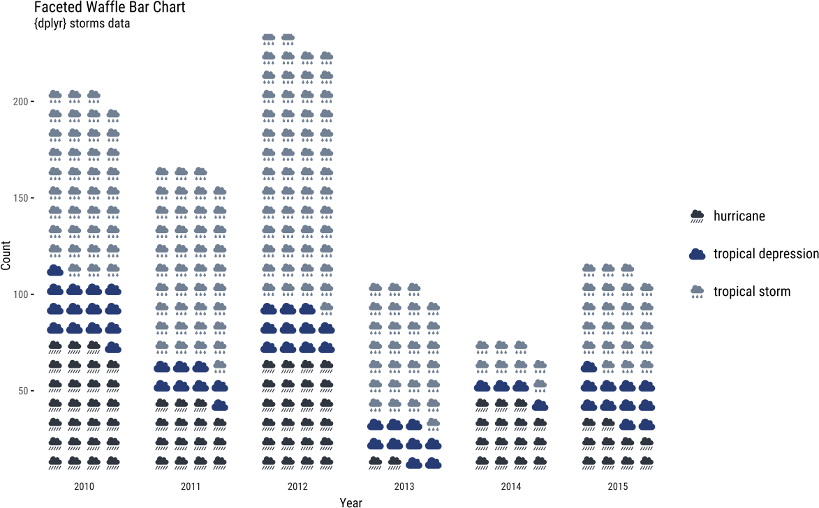
介紹如何使用 R 的 waffle 套件繪製鬆餅圖。
R 的 waffle 套件可以用來繪製鬆餅圖,以下是安裝與使用的教學。
安裝 waffle 套件
先安裝一些相依性套件:
# 安裝相依性套件
install.packages(c("ggplot2", "RColorBrewer", "gridExtra",
  "gtable", "extrafont", "curl", "stringr",
  "htmlwidgets", "DT", "rlang", "dplyr"))
透過以下任一種方式安裝 waffle 套件:
# 安裝 waffle 套件(任選一種安裝方式即可)
install.packages("waffle", repos = "https://cinc.rud.is")

# 安裝 waffle 套件(任選一種安裝方式即可)
devtools::install_git("https://git.rud.is/hrbrmstr/waffle.git")

# 安裝 waffle 套件(任選一種安裝方式即可)
devtools::install_git("https://git.sr.ht/~hrbrmstr/waffle")

# 安裝 waffle 套件(任選一種安裝方式即可)
devtools::install_gitlab("hrbrmstr/waffle")

# 安裝 waffle 套件(任選一種安裝方式即可)
devtools::install_bitbucket("hrbrmstr/waffle")

# 安裝 waffle 套件(任選一種安裝方式即可)
devtools::install_github("hrbrmstr/waffle")
繪製鬆餅圖
載入 waffle 函式庫:
# 載入 waffle 函式庫
library(waffle)
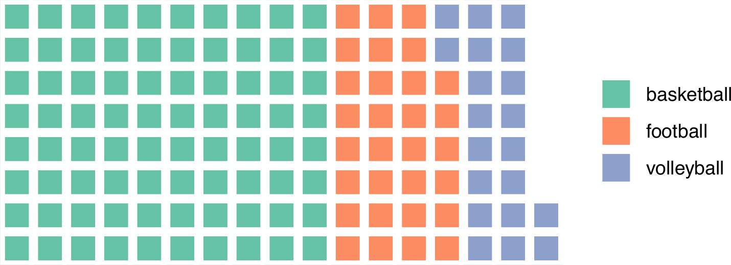
若要繪製鬆餅圖,最簡單的方式就是將資料準備好,直接呼叫 walffle 函數來繪製:
# 測試資料
parts <- data.frame(
  names = c("basketball", "football", "volleyball"),
  vals = c(80, 30, 20)
)

# 繪製鬆餅圖
waffle(parts, rows = 8)
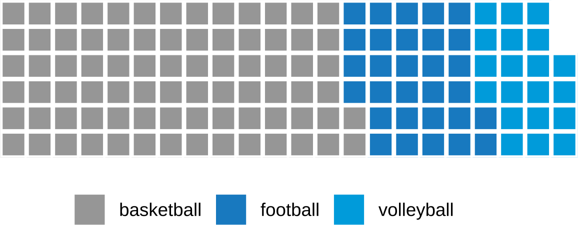
waffle 本身有許多繪圖參數可以使用,例如設定每一排有幾個區塊、區塊間隔寬度、區塊顏色、說明文字位置等:
# 繪製鬆餅圖
waffle(parts,
  rows = 6, # 一排六個區塊
  size = 1, # 區塊間隔寬度
  colors = c("#969696", "#1879bf", "#009bda"), # 自定區塊顏色
  legend_pos = "bottom" # 說明文字位置
)
多張鬆餅圖
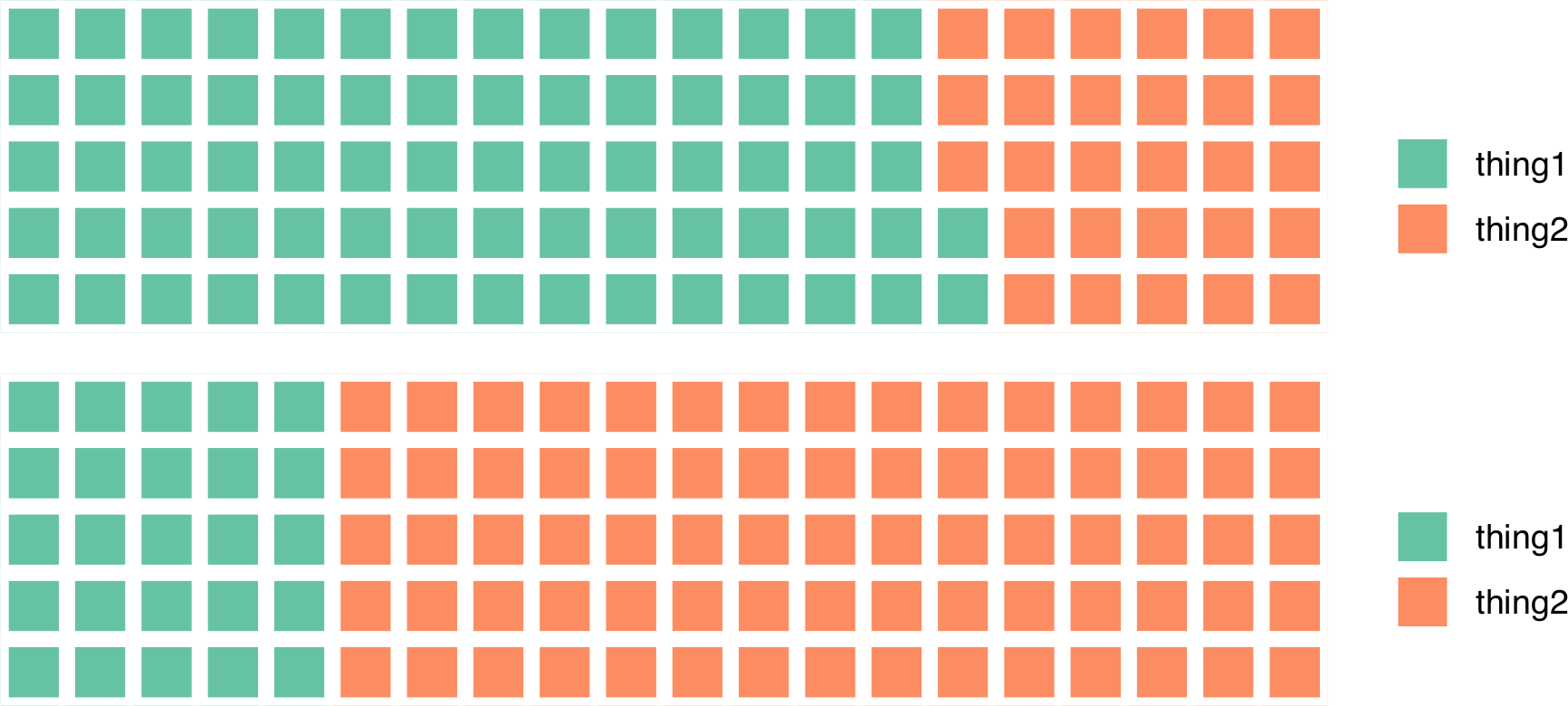
若要繪製多張鬆餅圖,然後合併再一起進行比較,可以使用 iron 函數。
# 多張鬆餅圖比較
iron(
  waffle(c(thing1 = 72, thing2 = 28), rows = 5),
  waffle(c(thing1 = 25, thing2 = 75), rows = 5)
)
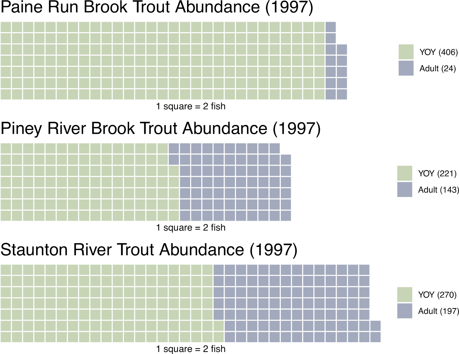
這是一個比較完整的多張鬆餅圖比較範例:
# 第一張鬆餅圖
pain.adult.1997 <- c("YOY (406)" = 406, "Adult (24)" = 24)
A <- waffle(
  pain.adult.1997 / 2,
  rows = 7,   # 一排七個區塊
  size = 0.5, # 區塊間隔寬度
  colors = c("#c7d4b6", "#a3aabd"), # 區塊顏色
  title = "Paine Run Brook Trout Abundance (1997)", # 標題
  xlab = "1 square = 2 fish", # X 軸標示文字
  pad = 3 # 右方加入 3 個區塊寬度的空白,讓說明文字對齊
)

# 第二張鬆餅圖
pine.adult.1997 <- c("YOY (221)" = 221, "Adult (143)" = 143)
B <- waffle(
  pine.adult.1997 / 2,
  rows = 7,   # 一排七個區塊
  size = 0.5, # 區塊間隔寬度
  colors = c("#c7d4b6", "#a3aabd"), # 區塊顏色
  title = "Piney River Brook Trout Abundance (1997)", # 標題
  xlab = "1 square = 2 fish", # X 軸標示文字
  pad = 8 # 右方加入 8 個區塊寬度的空白,讓說明文字對齊
)

# 第三張鬆餅圖
stan.adult.1997 <- c("YOY (270)" = 270, "Adult (197)" = 197)
C <- waffle(
  stan.adult.1997 / 2,
  rows = 7,   # 一排七個區塊
  size = 0.5, # 區塊間隔寬度
  colors = c("#c7d4b6", "#a3aabd"), # 區塊顏色
  title = "Staunton River Trout Abundance (1997)", # 標題
  xlab = "1 square = 2 fish" # X 軸標示文字
)

# 多張鬆餅圖比較
iron(A, B, C)
以 ggplot2 繪製鬆餅圖
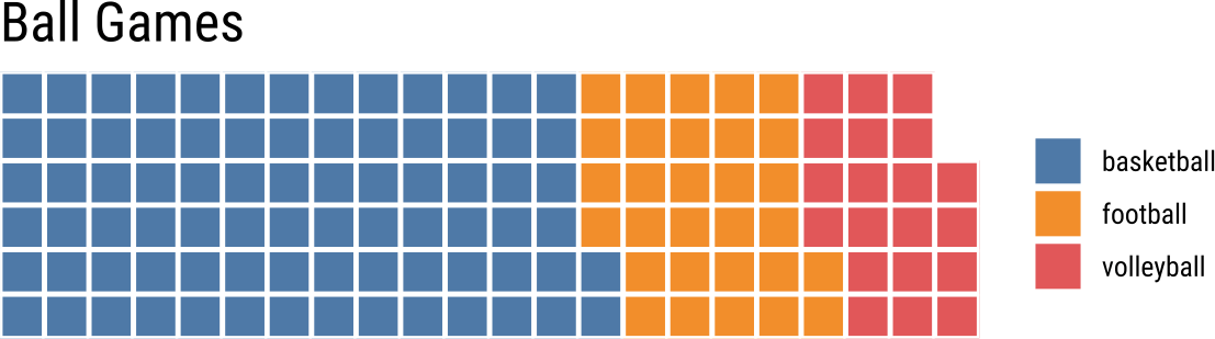
我們也可以使用標準的 ggplot 搭配 geom_waffle 來繪製鬆餅圖:
library(waffle)
library(hrbrthemes)

# 測試資料
parts <- data.frame(
  names = c("basketball", "football", "volleyball"),
  vals = c(80, 30, 20)
)

# 以 ggplot 繪製鬆餅圖
ggplot(parts, aes(fill = names, values = vals)) +
  geom_waffle(
    color = "white",  # 格線顏色
    size = 0.8,       # 區塊間隔寬度
    n_rows = 6        # 每排六個區塊
  ) +
  scale_x_discrete(expand = c(0, 0)) +        # 去除 X 軸周圍空白
  scale_y_discrete(expand = c(0, 0)) +        # 去除 Y 軸周圍空白
  ggthemes::scale_fill_tableau(name = NULL) + # 設定色盤
  coord_equal() +                             # 設定 X 與 Y 軸等比例
  labs(
    title = "Ball Games"                      # 設定標題
  ) +
  theme_ipsum_rc(grid = "") +                 # 移除背景
  theme_enhance_waffle()                      # 移除圖形上多餘的元件
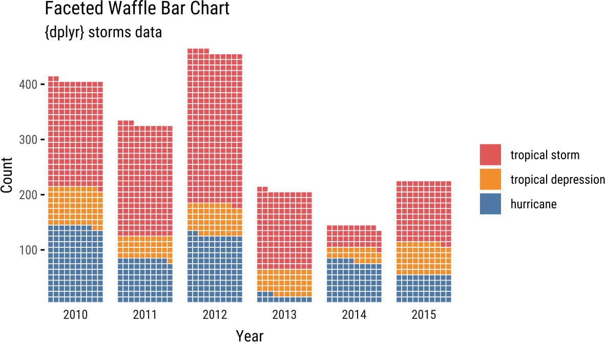
以下是官方提供的範例,以 ggplot 繪製分組的鬆餅圖:
library(dplyr)
library(waffle)

# 準備資料
storms_df <- storms %>%
  filter(year >= 2010) %>% # 篩選 2010 年之後的資料
  count(year, status)      # 依據 year 與 status 統計資料比數

# 以 ggplot 繪製鬆餅圖
ggplot(storms_df, aes(fill = status, values = n)) +
  geom_waffle(color = "white", size = .25, n_rows = 10, flip = TRUE) +
  facet_wrap(~year, nrow = 1, strip.position = "bottom") + # 依據 year 分組
  scale_x_discrete() +
  scale_y_continuous(labels = function(x) x * 10, # 設定乘數與 n_rows 相等
                     expand = c(0, 0)) +
  ggthemes::scale_fill_tableau(name=NULL) + # 設定色盤
  coord_equal() + # 設定 X 與 Y 軸等比例
  labs(
    title = "Faceted Waffle Bar Chart", # 標題
    subtitle = "{dplyr} storms data",   # 子標題
    x = "Year",                         # X 軸標示
    y = "Count"                         # Y 軸標示
  ) +
  theme_minimal(base_family = "Roboto Condensed") + # 設定使用 Roboto Condensed 字型
  theme(panel.grid = element_blank(), axis.ticks.y = element_line()) +
  guides(fill = guide_legend(reverse = TRUE))
使用 Font Awesome 5 字型繪製鬆餅圖
除了使用普通的方格之外,我們也可以使用 Font Awesome 5 字型來繪製鬆餅圖。
下載 Font Awesome 5 字型
從 Font Awesome 5 的 GitHub 網站下載 fa-brands-400.ttf、fa-solid-900.ttf、fa-regular-400.ttf 三個 TTF 字型檔案,放在適當的位置。
如果不想手動下載 Font Awesome 5 的 TTF 字型檔案,也可以在安裝好 waffle 套件之後,使用其所提供的 install_fa_fonts() 從系統上直接取得 TTF 字型檔。
# 載入 waffle 函式庫
library(waffle)

# 顯示 Font Awesome 5 字型檔案位置
install_fa_fonts()
若在 Linux 中,建議可以把 Font Awesome 5 的 TTF 字型放在 /usr/local/share/fonts 這個字型目錄之下,順便更新自己的字型庫,這樣系統上其他的軟體也可以使用(但在這裡的 R 中可以不需要):
# 更新字型庫
fc-cache -f -v
匯入 Font Awesome 5 字型
在 waffle 的官方文件中建議使用 extrafont 套件來安裝 Font Awesome 5 字型,但是我感覺 extrafont 並不是非常方便,因此這裡我們改用 showtext 套件來處理 Font Awesome 5 字型。
首先安裝好 showtext 套件並載入之後,使用 font_add 匯入自己下載的 TTF 字型檔案。除了 Font Awesome 5 字型之外,若要在繪圖時使用其他的字型(例如 Roboto Condensed),也可以一併在這裡匯入:
# 載入 showtext 套件
library(showtext)

# 新增 Font Awesome 5 字型
font_add(family = "FontAwesome5Free-Solid", regular = "/usr/local/share/fonts/fa-solid-900.ttf")
font_add(family = "FontAwesome5Free-Regular", regular = "/usr/local/share/fonts/fa-regular-400.ttf")
font_add(family = "FontAwesome5Brands-Regular", regular = "/usr/local/share/fonts/fa-brands-400.ttf")

# 新增 Roboto Condensed 字型
font_add("Roboto Condensed", regular = "/usr/local/share/fonts/RobotoCondensed-Regular.ttf")

# 啟用 showtext
showtext_auto()
這裡的三個 TTF 字型路徑請依照自己的狀況修改。
指定繪圖用的字型
在設定好 Font Awesome 5 字型之後,我們就可以使用 Font Awesome 5 字型來畫圖了。
若以 waffle 函數直接繪圖,可以搭配 use_glyph 來指定 Font Awesome 5 的圖示名稱:
# 測試資料
parts <- data.frame(
  names = c("basketball", "football", "volleyball"),
  vals = c(17, 10, 5)
)

# 以 waffle 繪製鬆餅圖
waffle(parts,
  rows = 3,                                    # 每排三個區塊
  colors = c("#969696", "#1879bf", "#009bda"), # 自定區塊顏色
  use_glyph = "football-ball",                 # 自定 Font Awesome 5 圖示
  size = 8                                     # 區塊間隔寬度
) + expand_limits(y = c(0, 4))

圖示跟顏色一樣,可以根據不同的類型指定不同的圖示:
# 以 waffle 繪製鬆餅圖
waffle(parts,
  rows = 3,                                    # 每排三個區塊
  colors = c("#969696", "#1879bf", "#009bda"), # 自定區塊顏色
  use_glyph = c("basketball-ball", "football-ball", "volleyball-ball"), # 自定 Font Awesome 5 圖示
  size = 8                                     # 區塊間隔寬度
) + expand_limits(y = c(0, 4))

若用 ggplot 的方式,可搭配 geom_pictogram 並以 scale_label_pictogram 與 scale_color_manual 來指定圖示與顏色:
# 測試資料
parts <- data.frame(
  names = c("basketball", "football", "volleyball"),
  vals = c(17, 10, 5)
)

# 以 ggplot 繪製鬆餅圖
ggplot(parts, aes(label = names, values = vals, color = names)) +
  geom_pictogram(n_rows = 4) + # 以圖示繪製鬆餅圖
  scale_color_manual( # 指定顏色
    name = NULL,
    values = c(
      basketball = "#969696",
      football = "#1879bf",
      volleyball = "#009bda"
    )
  ) +
  scale_label_pictogram( # 指定圖示
    name = NULL,
    values = c(
      basketball = "basketball-ball",
      football = "football-ball",
      volleyball = "volleyball-ball"
    )
  ) +
  coord_equal() +           # 設定 X 與 Y 軸等比例
  theme_ipsum_rc(grid="") + # 移除背景
  theme_enhance_waffle() +  # 移除圖形上多餘的元件
  theme(legend.key.height = unit(2.25, "line")) + # 以下皆為圖形微調參數
  theme(legend.text = element_text(size = 12, hjust = 0, vjust = 0.9)) +
  expand_limits(y = c(0, 5))

以下是用 ggplot 繪製分組的鬆餅圖,並自訂圖示的範例:
library(dplyr)
library(waffle)

# 準備資料
storms_df <- storms %>%
  filter(year >= 2010) %>% # 篩選 2010 年之後的資料
  count(year, status)      # 依據 year 與 status 統計資料比數

# 以 ggplot 繪製鬆餅圖
ggplot(storms_df, aes(label = status, values = n/5)) +
  geom_pictogram(
    n_rows = 4,            # 一排四個區塊
    size = 4,              # 區塊大小
    aes(colour = status),  # 顏色對應
    flip = TRUE            # X 與 Y 軸對調
  ) +
  scale_color_manual(      # 指定顏色
    name = NULL,
    values = c("#2f3640", "#273c75", "#718093"),
    labels = c("hurricane", "tropical depression", "tropical storm")
  ) +
  scale_label_pictogram(   # 指定圖示
    name = NULL,
    values = c("cloud-showers-heavy", "cloud", "cloud-rain"),
    labels = c("hurricane", "tropical depression", "tropical storm")
  ) +
  facet_wrap(~year, nrow = 1, strip.position = "bottom") + # 依據 year 分組
  scale_x_discrete() +
  scale_y_continuous(labels = function(x) x * 10, # 設定乘數與 n_rows 相等
                     expand = c(0, 0)) +
  ggthemes::scale_fill_tableau(name=NULL) + # 設定色盤
  coord_equal() + # 設定 X 與 Y 軸等比例
  labs(
    title = "Faceted Waffle Bar Chart", # 標題
    subtitle = "{dplyr} storms data",   # 子標題
    x = "Year",                         # X 軸標示
    y = "Count"                         # Y 軸標示
  ) +
  theme_minimal(base_family = "Roboto Condensed") + # 設定使用 Roboto Condensed 字型
  theme(panel.grid = element_blank(), axis.ticks.y = element_line()) +
  guides(fill = guide_legend(reverse = TRUE)) +
  theme(legend.key.height = unit(2.25, "line")) +
  theme(legend.text = element_text(size = 12, hjust = 0, vjust = 0.7))