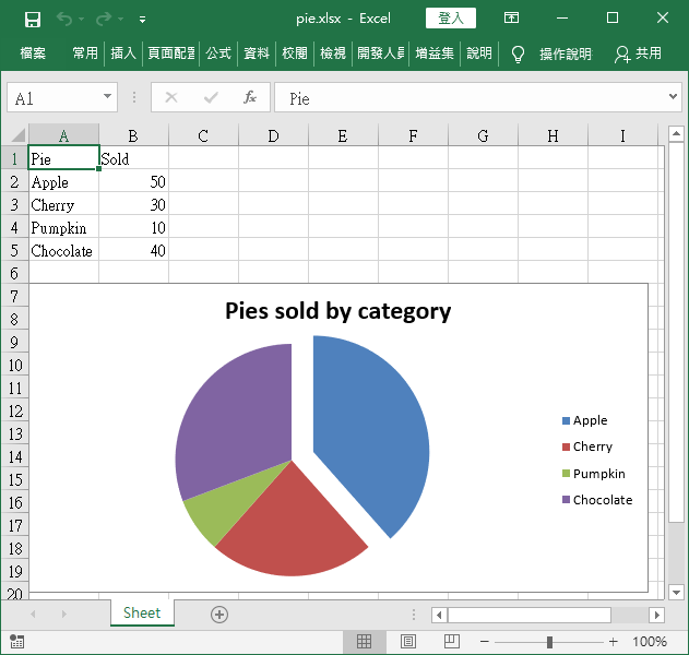
介紹如何在 Python 中使用 openpyxl 模組繪製各種圖形,輸出至 Excel 檔案中。
長條圖
在建立圖形之前,先產生一些測試用的資料,放進 Excel 表格中。
from openpyxl import Workbook
from openpyxl.chart import BarChart, Reference, Series

# 新增 Excel 活頁簿
wb = Workbook()

# 取得目前工作表
ws = wb.active

# 將測試資料填入 Excel 工作表
for i in range(10):
    ws.append([i])
接著以 Reference 建立繪圖用資料的參照,再呼叫 BarChart 繪製長條圖。
# 參照值
values = Reference(ws, min_col=1, min_row=1, max_col=1, max_row=10)

# 建立長條圖
chart = BarChart()

# 將資料加入圖形
chart.add_data(values)

# 將圖形放置在 C3 儲存格位置
ws.add_chart(chart, "C3")
最後將結果儲存至 Excel 檔案中。
# 儲存 Excel 檔案
wb.save("SampleChart.xlsx")
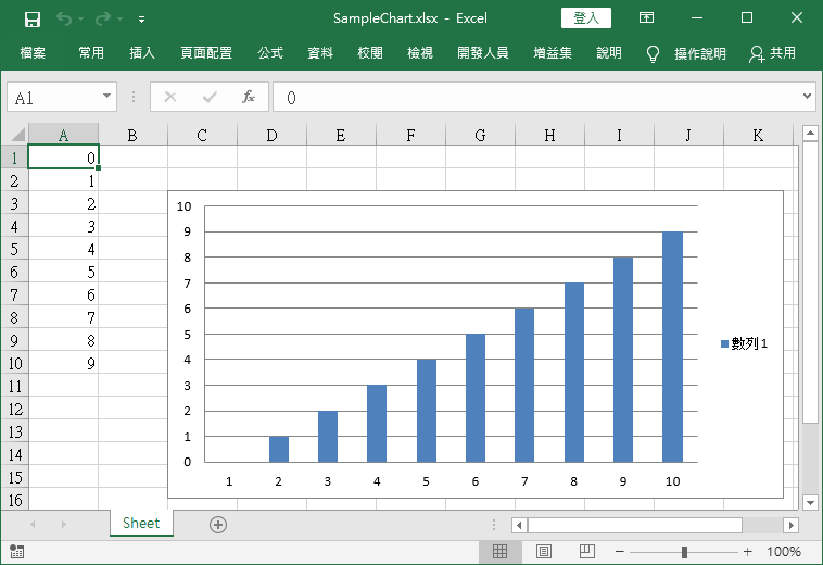
產生的 Excel 檔案內容會像這樣。
多變數長條圖
在建立圖形之前,先產生一些測試用的資料,放進 Excel 表格中。
from openpyxl import Workbook
from openpyxl.chart import BarChart, Series, Reference

# 新增 Excel 活頁簿
wb = Workbook()

# 取得目前工作表
ws = wb.active

# 建立測試資料
rows = [
    ('Number', 'Batch 1', 'Batch 2'),
    (2, 10, 30),
    (3, 40, 60),
    (4, 50, 70),
    (5, 20, 10),
    (6, 10, 40),
    (7, 50, 30),
]

# 將測試資料填入 Excel 工作表
for row in rows:
    ws.append(row)
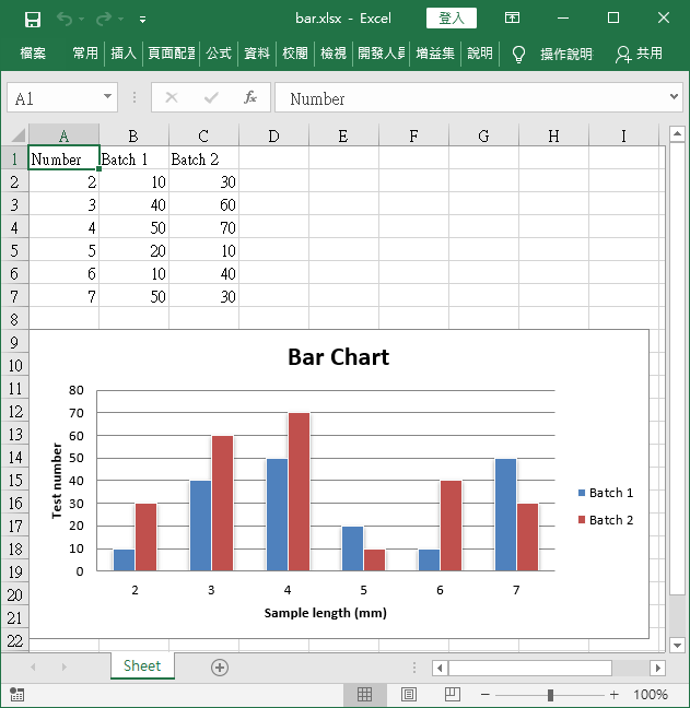
接著呼叫 BarChart 繪製長條圖。
# 建立長條圖
chart = BarChart()
chart.type = "col"
chart.style = 10
chart.title = "Bar Chart"
chart.y_axis.title = 'Test number'
chart.x_axis.title = 'Sample length (mm)'

data = Reference(ws, min_col=2, min_row=1, max_row=7, max_col=3)
cats = Reference(ws, min_col=1, min_row=2, max_row=7)
chart.add_data(data, titles_from_data=True)
chart.set_categories(cats)
chart.shape = 4
ws.add_chart(chart, "A9")

wb.save("bar.xlsx")
平面區域圖
在建立圖形之前,先產生一些測試用的資料,放進 Excel 表格中。
from openpyxl import Workbook
from openpyxl.chart import AreaChart, Reference, Series

# 新增 Excel 活頁簿
wb = Workbook()

# 取得目前工作表
ws = wb.active

# 建立測試資料
rows = [
    ['Number', 'Batch 1', 'Batch 2'],
    [2, 40, 30],
    [3, 40, 25],
    [4, 50, 30],
    [5, 30, 10],
    [6, 25, 5],
    [7, 50, 10],
]

# 將測試資料填入 Excel 工作表
for row in rows:
    ws.append(row)
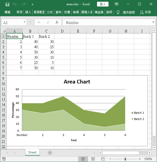
建立 BarChart 物件,並調整圖形的屬性。
# 建立平面區域圖
chart = AreaChart()

# 圖形屬性
chart.title = "Area Chart"         # 標題
chart.style = 13                   # 樣式
chart.x_axis.title = 'Test'        # X 軸標題
chart.y_axis.title = 'Percentage'  # Y 軸標題
接著以 Reference 建立繪圖用資料的參照,繪製圖形。
# 參照值
cats = Reference(ws, min_col=1, min_row=1, max_row=7)
data = Reference(ws, min_col=2, min_row=1, max_col=3, max_row=7)

# 將資料加入圖形
chart.add_data(data, titles_from_data=True)

# 設定 X 軸標示值
chart.set_categories(cats)

# 將圖形放置在 A9 儲存格位置
ws.add_chart(chart, "A9")

# 儲存 Excel 檔案
wb.save("area.xlsx")
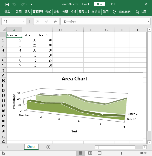
立體區域圖
立體區域圖的繪製方式跟平面區域圖相同,只是將 AreaChart 改為 AreaChart3D 而已。
from openpyxl import Workbook
from openpyxl.chart import AreaChart3D, Reference, Series

wb = Workbook()
ws = wb.active

rows = [
    ['Number', 'Batch 1', 'Batch 2'],
    [2, 30, 40],
    [3, 25, 40],
    [4 ,30, 50],
    [5 ,10, 30],
    [6,  5, 25],
    [7 ,10, 50],
]

for row in rows:
    ws.append(row)

# 建立立體區域圖
chart = AreaChart3D()
chart.title = "Area Chart"
chart.style = 13
chart.x_axis.title = 'Test'
chart.y_axis.title = 'Percentage'
chart.legend = None

cats = Reference(ws, min_col=1, min_row=1, max_row=7)
data = Reference(ws, min_col=2, min_row=1, max_col=3, max_row=7)
chart.add_data(data, titles_from_data=True)
chart.set_categories(cats)

ws.add_chart(chart, "A9")

wb.save("area3D.xlsx")
折線圖
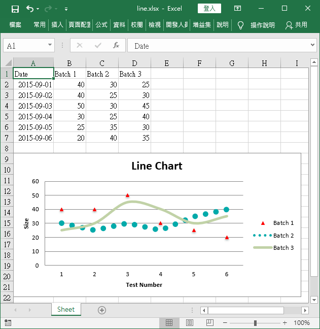
以下是折線圖的範例。
from datetime import date
from openpyxl import Workbook
from openpyxl.chart import LineChart, Reference
from openpyxl.chart.axis import DateAxis

# 新增 Excel 活頁簿
wb = Workbook()

# 取得目前工作表
ws = wb.active

# 建立測試資料
rows = [
    ['Date', 'Batch 1', 'Batch 2', 'Batch 3'],
    [date(2015,9, 1), 40, 30, 25],
    [date(2015,9, 2), 40, 25, 30],
    [date(2015,9, 3), 50, 30, 45],
    [date(2015,9, 4), 30, 25, 40],
    [date(2015,9, 5), 25, 35, 30],
    [date(2015,9, 6), 20, 40, 35],
]

# 將測試資料填入 Excel 工作表
for row in rows:
    ws.append(row)

# 建立折線圖
chart = LineChart()
chart.title = "Line Chart"
chart.style = 13
chart.y_axis.title = 'Size'
chart.x_axis.title = 'Test Number'

# 參照值
data = Reference(ws, min_col=2, min_row=1, max_col=4, max_row=7)
chart.add_data(data, titles_from_data=True)

# 設定第 1 條線的樣式
s1 = chart.series[0]
s1.marker.symbol = "triangle" # 三角形
s1.marker.graphicalProperties.solidFill = "FF0000" # 填滿顏色
s1.marker.graphicalProperties.line.solidFill = "FF0000" # 外框線條顏色
s1.graphicalProperties.line.noFill = True

# 設定第 2 條線的樣式
s2 = chart.series[1]
s2.graphicalProperties.line.solidFill = "00AAAA"
s2.graphicalProperties.line.dashStyle = "sysDot"
s2.graphicalProperties.line.width = 100050 # 線條寬度,單位為 EMUs

# 設定第 3 條線的樣式
s3 = chart.series[2]
s3.smooth = True # 讓線條平滑

# 將圖形放置在 A9 儲存格位置
ws.add_chart(chart, "A9")

# 儲存 Excel 檔案
wb.save("line.xlsx")
圓餅圖
以下是圓餅圖的範例。
from openpyxl import Workbook
from openpyxl.chart import PieChart, ProjectedPieChart, Reference
from openpyxl.chart.series import DataPoint

# 新增 Excel 活頁簿
wb = Workbook()

# 取得目前工作表
ws = wb.active

# 建立測試資料
data = [
    ['Pie', 'Sold'],
    ['Apple', 50],
    ['Cherry', 30],
    ['Pumpkin', 10],
    ['Chocolate', 40],
]

# 將測試資料填入 Excel 工作表
for row in data:
    ws.append(row)

# 參照值
labels = Reference(ws, min_col=1, min_row=2, max_row=5) # 標示文字
data = Reference(ws, min_col=2, min_row=1, max_row=5)   # 資料

# 建立圓餅圖
pie = PieChart()
pie.add_data(data, titles_from_data=True)
pie.set_categories(labels)
pie.title = "Pies sold by category"

# 將圓餅圖的第一塊拆開
slice = DataPoint(idx=, explosion=20)
pie.series[0].data_points = [slice]

# 將圖形放置在 A7 儲存格位置
ws.add_chart(pie, "A7")

# 儲存 Excel 檔案
wb.save("pie.xlsx")